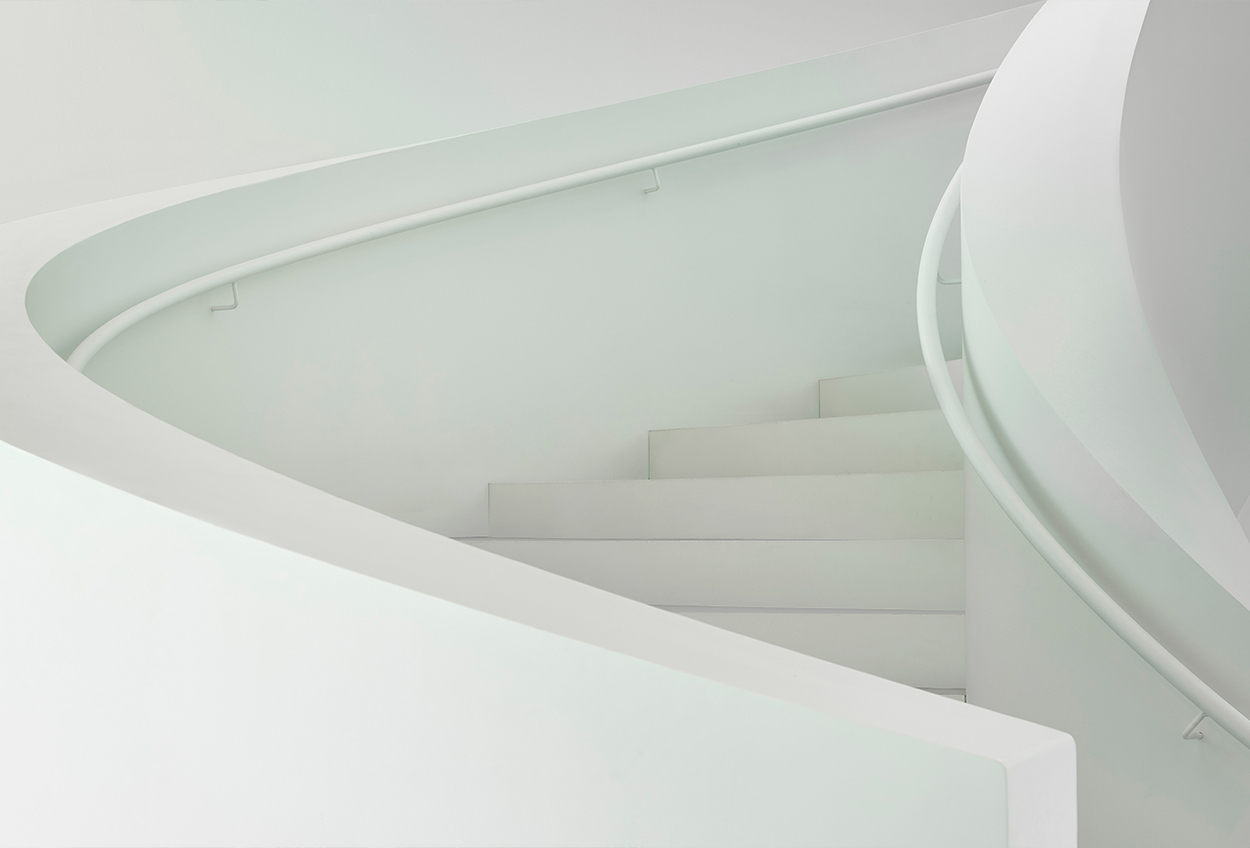

Just white? No, no! Just WOW!
In design, if we think of the colour white we tend to recall the smooth rectilinear surfaces associated with Minimalism and early Modernism. Think of the Rietveld Schröder House in Utrecht, or Le Corbusier’s Villa Savoye, or the Armonia Apartments in Athens by the British architect, John Pawson.
But, of course, there’s a flip-side for white in design. When you add curves to white surfaces, they become something completely different because light and shadow create amazingly sensual effects.
And when this happens, in stairs, white turns into WOW…
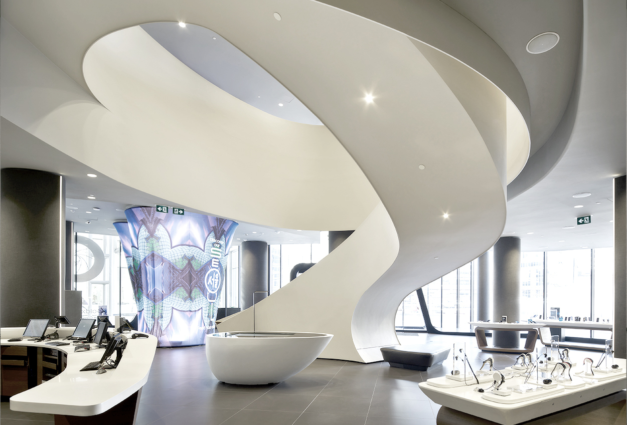
Ice cream, anyone?
When you step into the Samsung Experience store at the Eaton Center in Toronto, the two-level space is dominated by an extraordinary staircase – like the last swirl of soft ice cream inside a cone. The way the upper balustrade curves down into the staircase balustrade is pure visual magic – emphasised by the whiteness and the perfect line of the soffit’s edge.
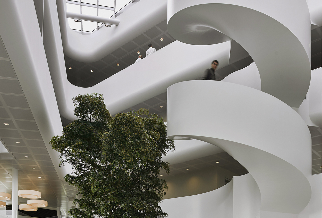
With perfect logic, the atrium in the headquarters of Vreugdenhil Dairy Foods in the Netherlands, designed by Maas Architecten and SOM=, features a milk-white staircase that rotates around a tree in a ‘lazy’ way according to Maas. In this case, the gloss-painted EeSoffit gives the whiteness a super-smooth shine.
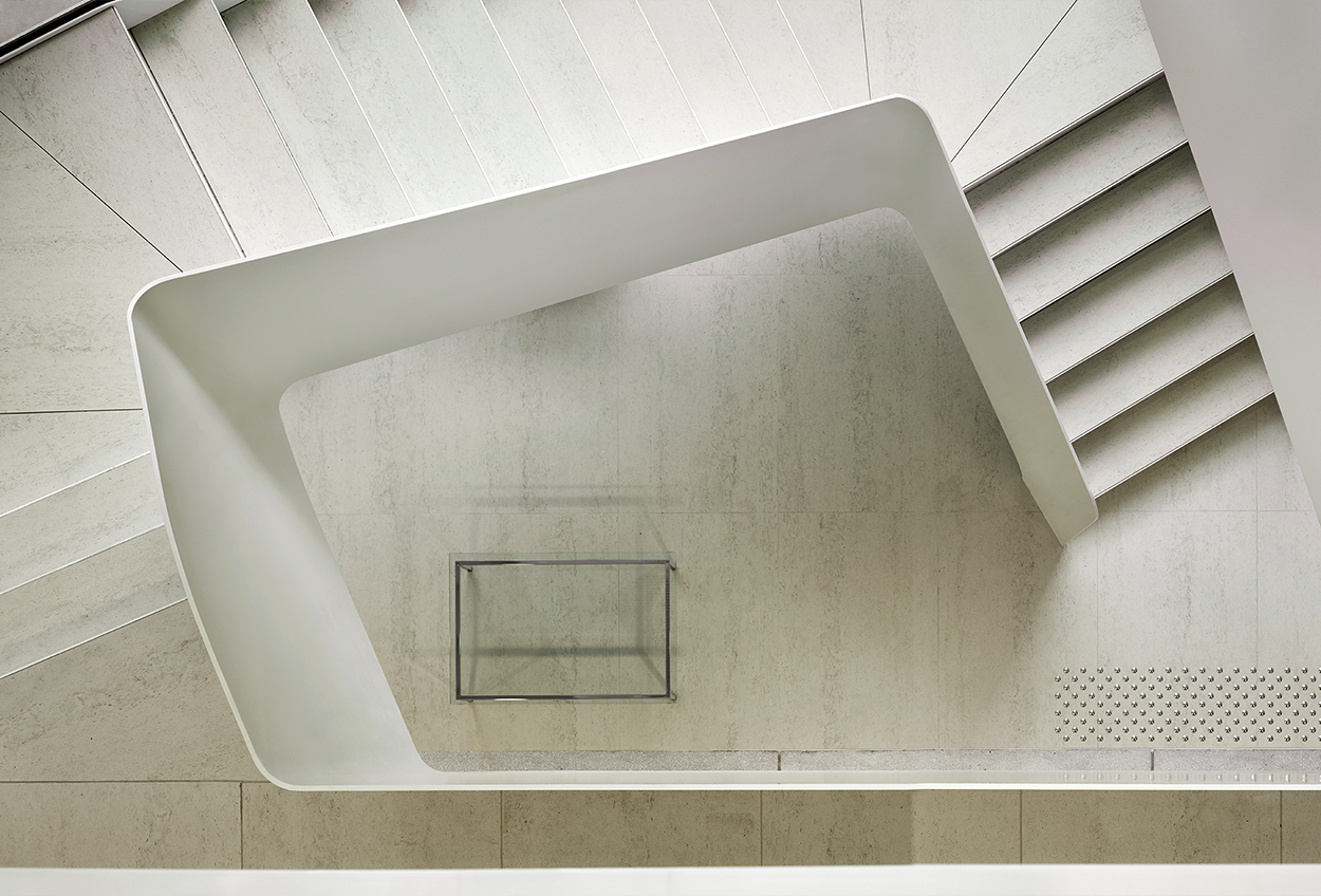
Let’s learn from the Greeks
The Pericles office building in Brussels features a staircase of great finesse – Minimalist design at its finest by Vorm Interieurgroep. Note the grey-white stone floor and treads, and the white steel balustrade: the soft colours of the floor and treads emphasise the stiffness and strength of the balustrade. Pericles was a famous ancient Greek politician, and one of his sayings was: ‘We cultivate refinement without extravagance.’ Which describes the design of these stairs perfectly…
So simple, so effective
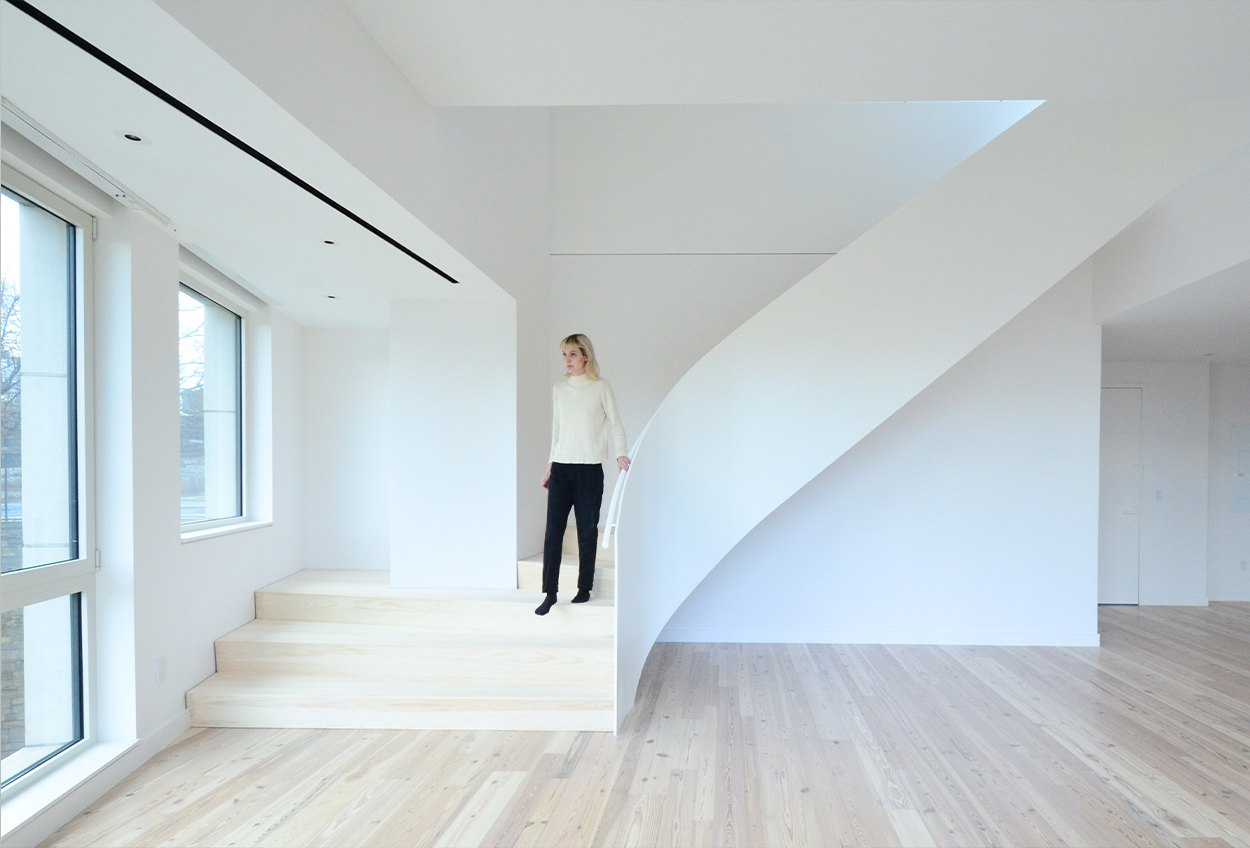
This apartment in Brooklyn, New York, could not be more straightforward – an open space and stairs whose thin steel balustrade has just one gentle curve. Everything is painted white and there is no deliberate visual drama in the interior design. But look a little closer, and where the balustrade joins the ceiling you’ll notice the beautiful way the light falls onto the wall. Which would definitely Which would definitely not have the same effect if the stairs or ceiling had not been pure white.
Wow, Wower, Wowest
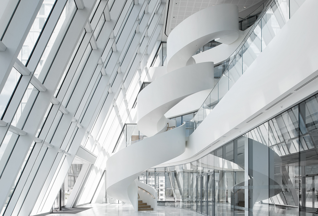
These stairs in an office tower at Canary Wharf, London, are probably the most structurally and visually dramatic we’ve ever made. The geometry is asymmetrical in plan and elevation – hugely complex to make and install. The rotation of the balustrades is visually thrilling, a balletic pirouette that could only be wearing white! Designers and collaborators of this project were tp bennett, Adamson Associate Architects, Spinocchia Freund, and Arup.
White is perfect for bright ideas
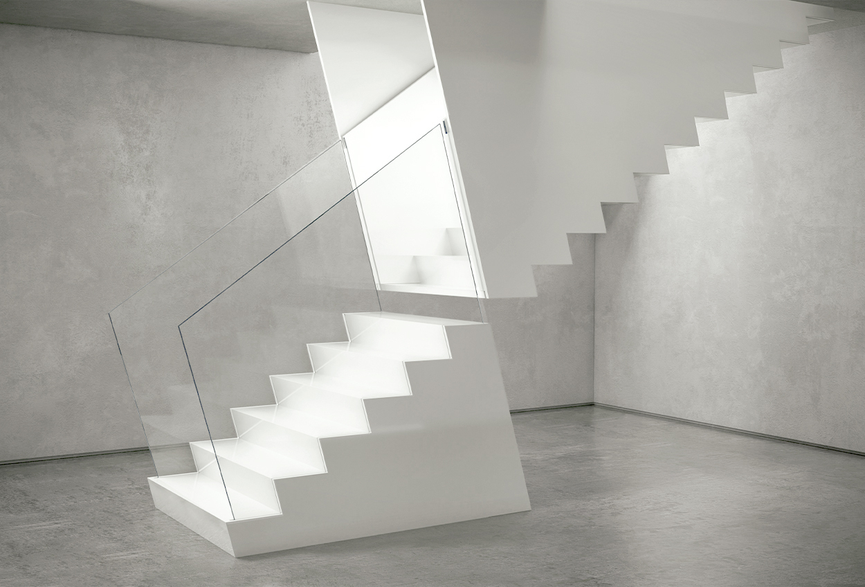
We’ve made and installed hundreds of feature stairs. But we’re also seriously into design ideas – innovations that will encourage our clients to be bold. Here’s a design from our own EeLab – a staircase with a mirroring effect. We think the way the lower glass balustrades switch to white steel balustrades is highly effective because of the contrast between the two materials.
And, finally, how beautiful is this?
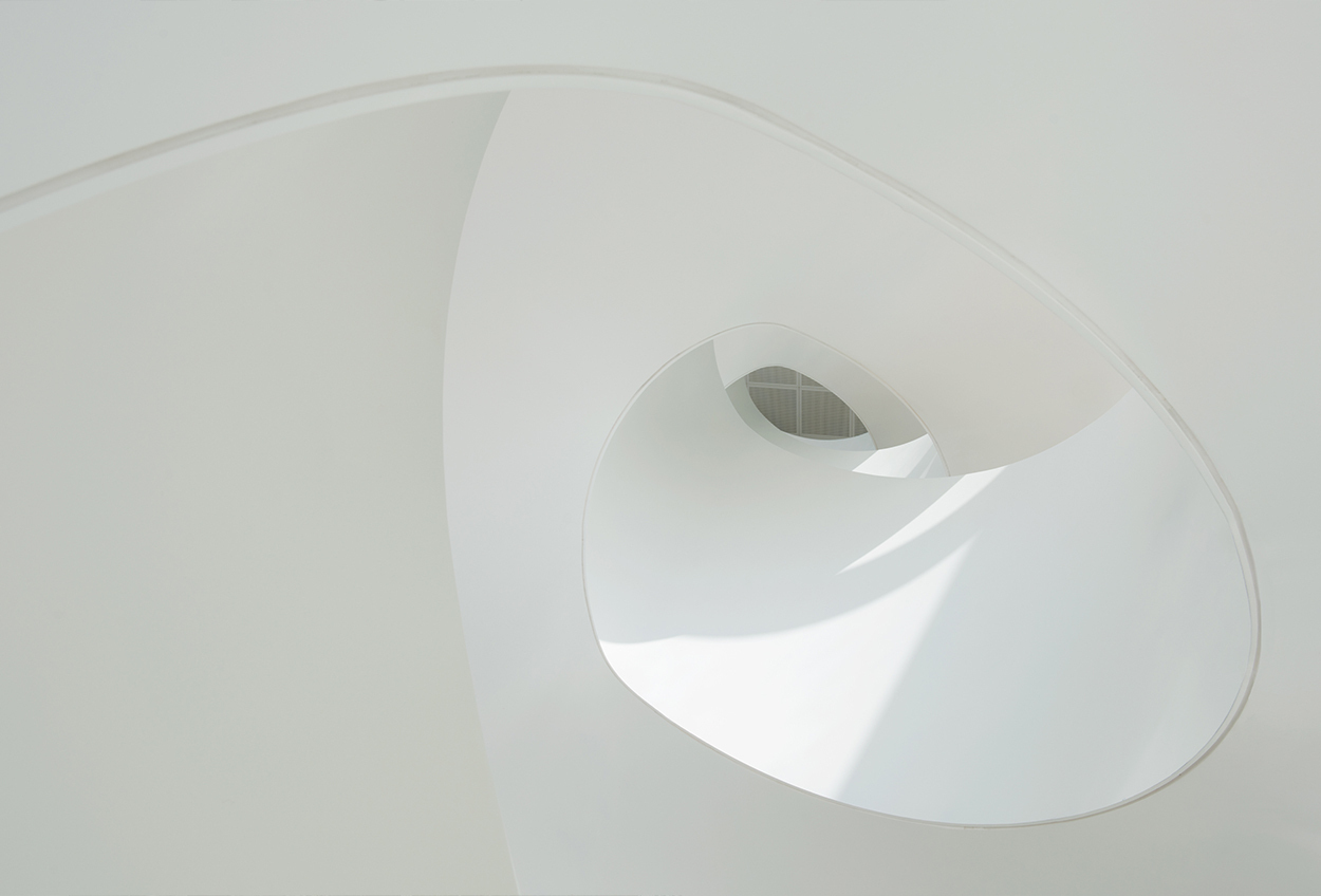
Curves… light… shadows. This image really sums up the magical design potential of white staircases. Note the subtly different shades of white and grey on the balustrades and soffit. And, as you can see, the most crucial ingredient here is the perfectly smooth, precisely edged EeSoffit.