SIG Benelux, Waalwijk [NL]
EeStairs + Kern Architecten
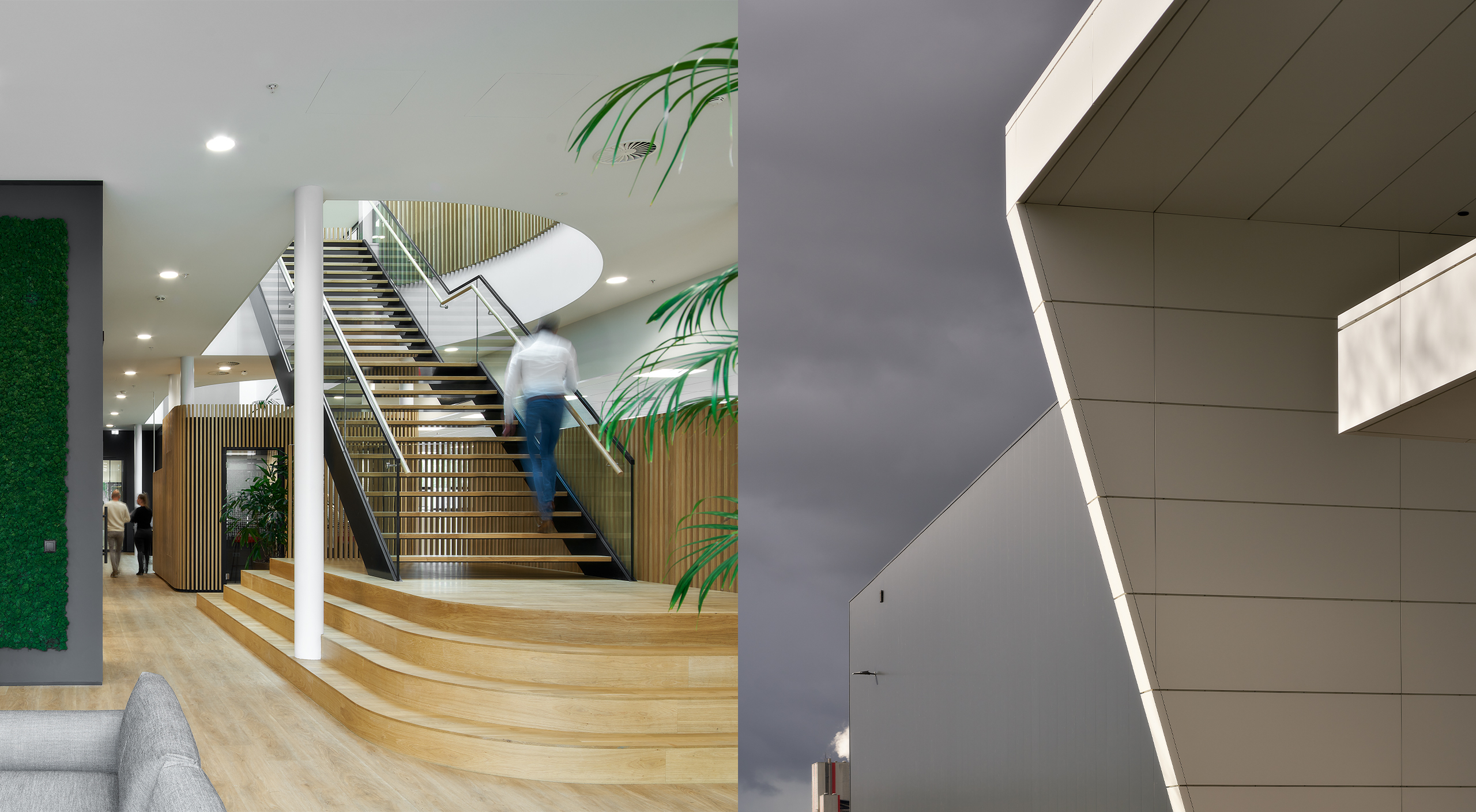
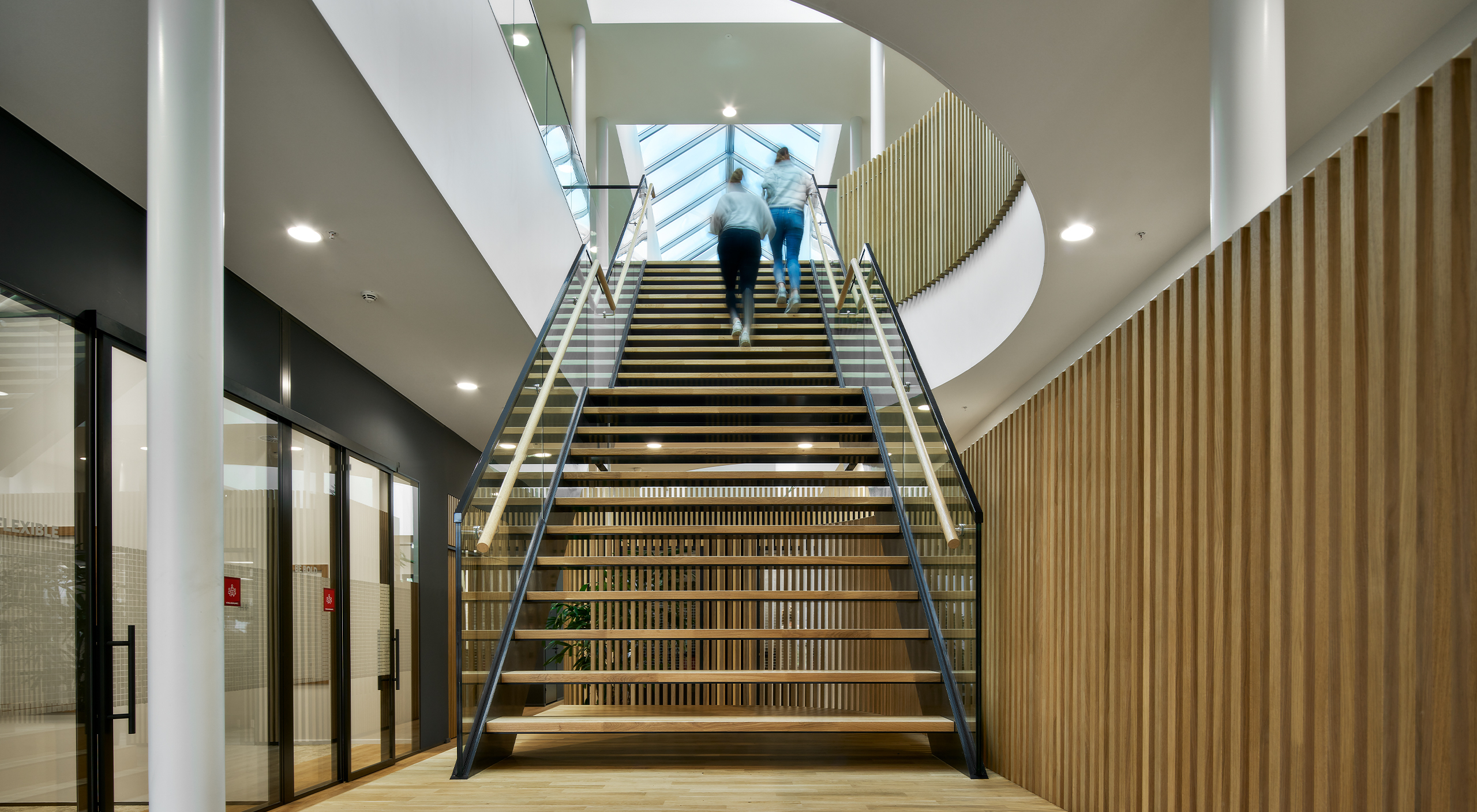
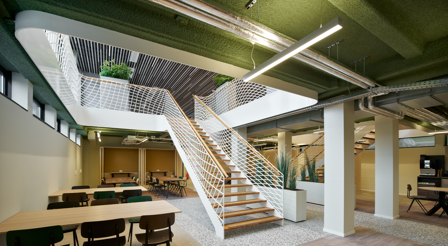
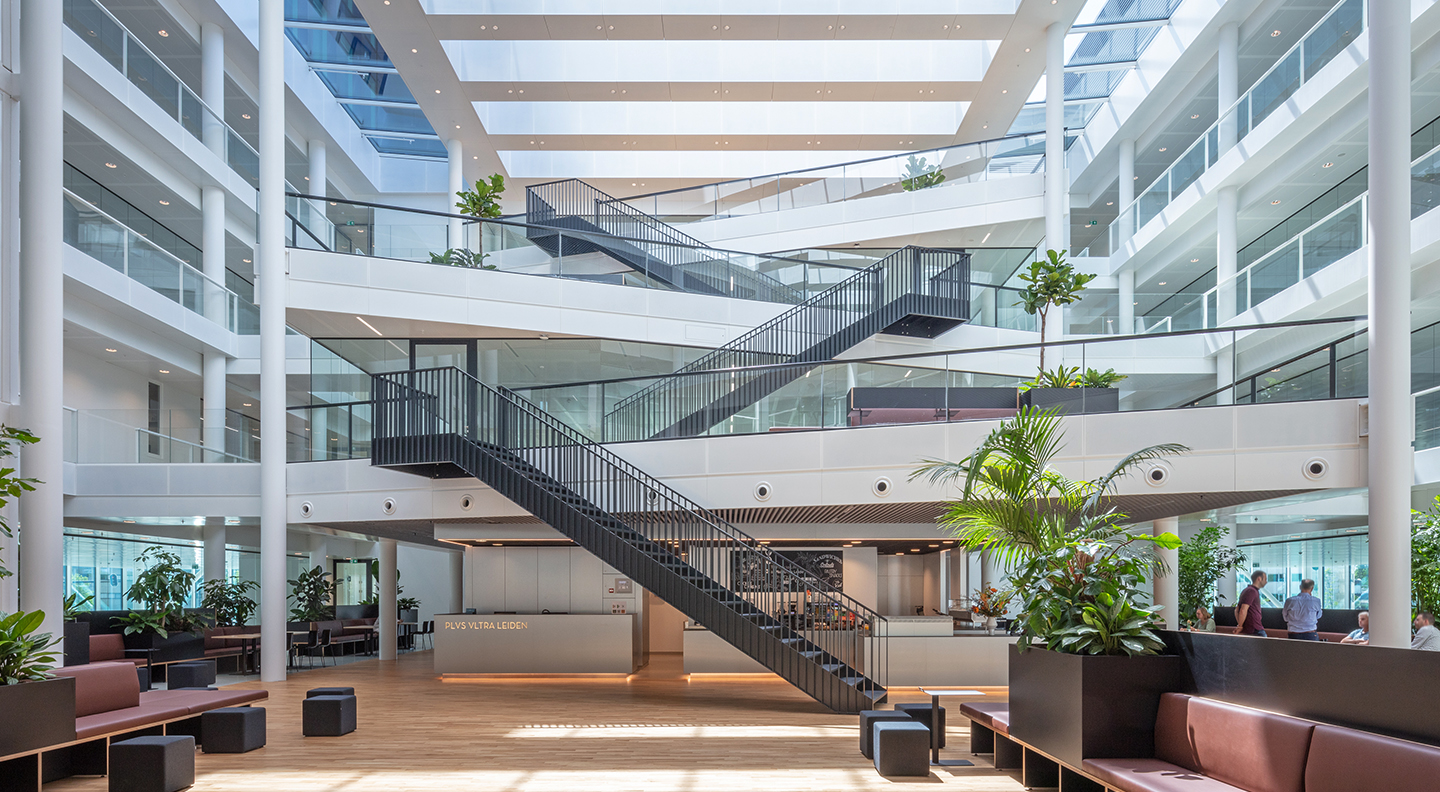
At first glance, these stairs at a new distribution building for Sig, a leading European supplier of insulation, epitomise the Less is More design mantra – though there is one surprising variation. When there’s less, the key issue is to get lines, joints, surfaces and details exactly right. If they’re not, the clarity of the design can be ruined.
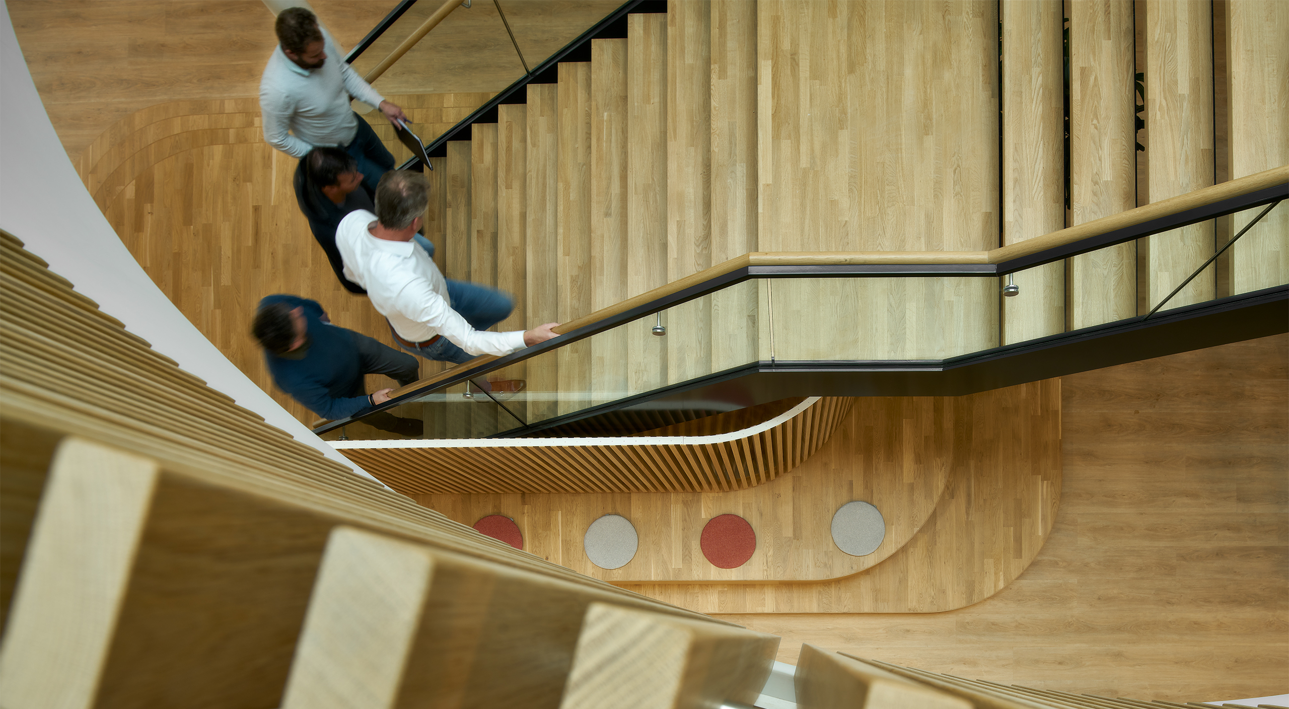
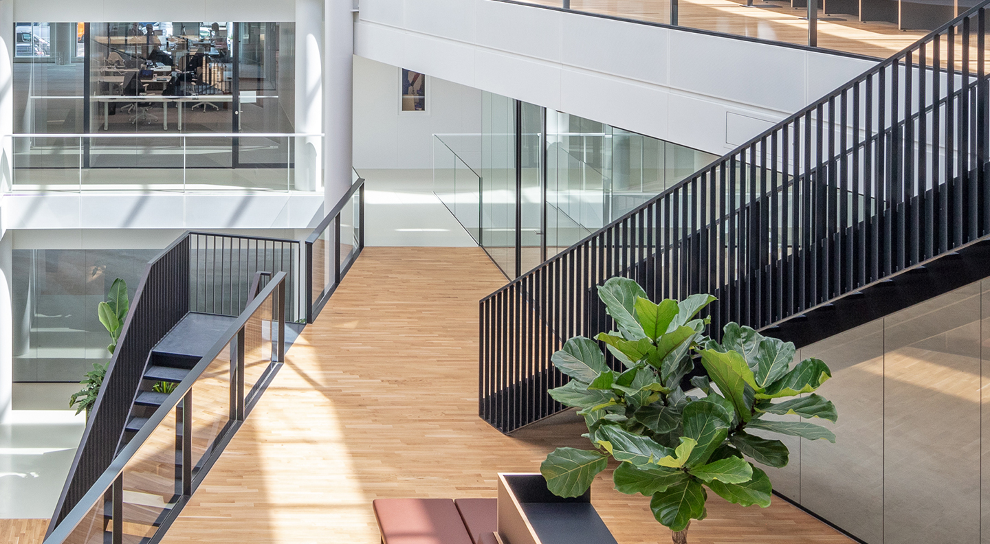
As you can see, we ensured that the alignment of the steel stringers with the oak handrails and metal balustrade caps were absolutely parallel. We took equal care when cutting and fitting the stair treads. The result is that every element of the staircase is perfectly rectilinear.
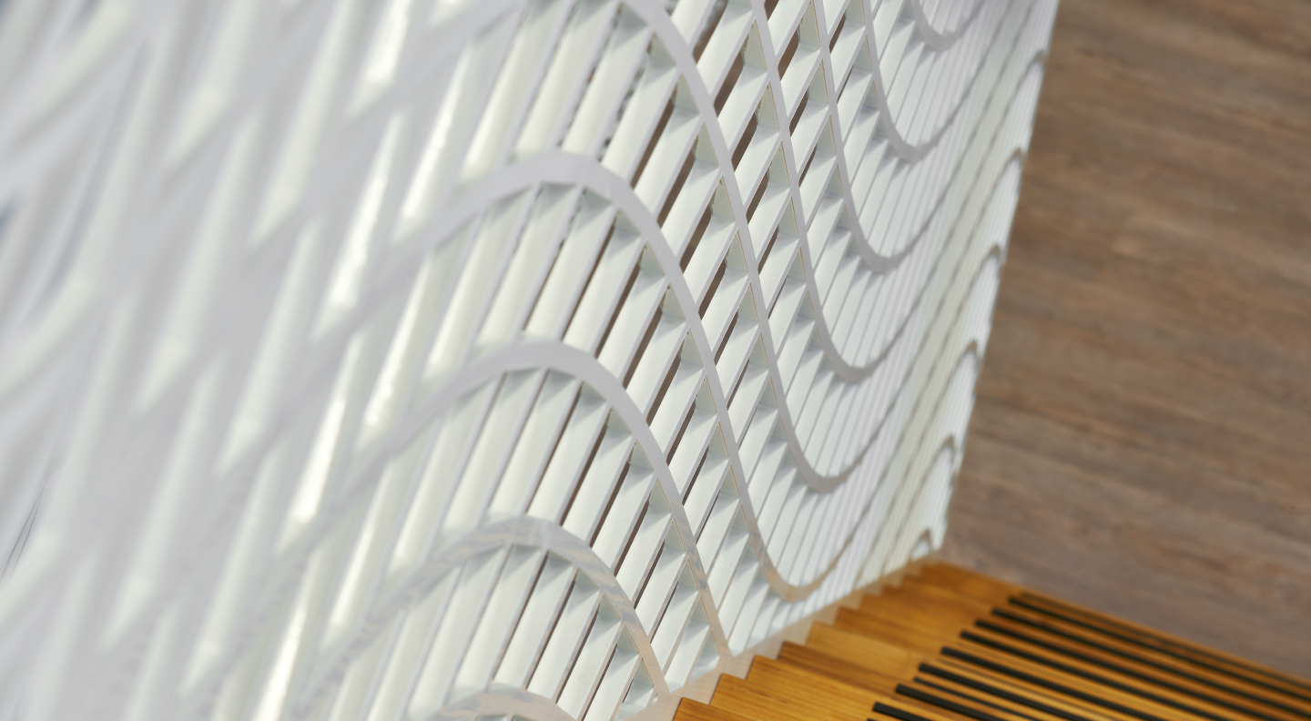
Well, almost every element! In fact, there is one small but pleasurable detail which breaks that rule. The metal capping of the balustrades has a raised U-section to make it more interesting to grip. Needless to say, we formed this section just as accurately as the rest of the staircase.
